
Quality Practice
Engaging effectively with the public requires significant expertise. Having a model of what excellent engagement looks like can help all of us develop our skills and leadership.
We believe that universities have a vital role to play in engaging more people in knowledge production and use. To do so we need to cultivate a step change in our collective expertise in engagement.
Why high quality engagement matters
Done well engagement can have huge value. It can inspire and inform publics; it can bring in critical insights into research practice; it can equip people with new skills and connections; inspire new ways of working and living; inform attitudes; encourage empathy; build societal value; and inform research agendas. Public engagement done well has huge potential to change how people think, what people do and how the world works.
However, done poorly public engagement realises none of this, and can even lead to harm for those involved. So taking time to consider an appropriate approach, learning from others, and ensuring that the same quality of planning and thought that is brought into research is brought into the engagement is time well spent.

In researching a sensitive and difficult topic like domestic violence, it has been extremely heartening to have overwhelming support from the public, local agencies and government departments. Public engagement is so integral to this project that it has grown on me like a second skin – I simply cannot imagine doing the research without it.
Ten principles of high quality engagement
Here are some of our favourite principles for high quality practice that apply to all forms of engagement:
- Understand your purpose and your context
- Consider carefully the people you hope to involve in your engagement work, and the role of equality, diversity and inclusion in your approach
- Design your approach with your purpose and people in mind, and where possible involve others in the design phase
- Use evaluation strategically, and make sure you use it to reflect on your work, and with your team
- Anticipate, explore and manage ethical implications of your work, and ensure that you do no harm
- Plan and resource your work appropriately, getting help where needed. Be sure you have expert administrative support.
- If you work in partnership with others, take good practice partnership principles into your work
- Reflect on the power dynamics in your work, and address these appropriately
- Consider if and how you will sustain your work, and manage expectations of those involved
- Work with others with relevant knowledge, networks and expertise – this could be public engagement professionals within your institution, or partnering organisation
Purposeful engagement practice

Inspiring

Collaborating

Consulting
Learning from others
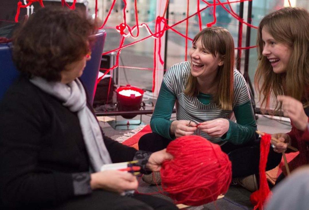
Public engagement activity takes many forms, and it really helps to take time to learn from other people’s practice and to find inspiration there. There are three broad approaches to engagement that you might want to explore: inspiring, consulting and collaborating, each with very different purposes.
Inspiring and informing
Lots of public engagement is focused on inspiring learning and curiosity. Typical approaches include lectures and workshops; media; interactive shows and festivals.
Consulting
Another focus for engagement can be to actively listen to the public’ views, concerns and interests, ensuring your research and teaching is sensitive to its social and ethical context. Consulting with publics about research, whether it be determining the research question, or exploring potential implications of the methodology or outcomes, is a key way to engage the public.
Collaborating
Collaboration involved working in partnership to solve problems and pool expertise. Approaches include co-production, citizen science and community engagement. Publics and communities may be involved in all aspects of the research cycle or at certain stages.


Reflection
Communication

Empathy
Being a high-quality practitioner
Following a tick list will not automatically ensure that your engagement is high quality – so it is important to cultivate attributes that can help you develop as an engagement practitioner. If you have never engaged the public before we encourage you to join in someone else’s activity, where there is support available for you to develop your approach. This lays the foundations for skills development, and to find out the forms of engagement that suit you and your work.
The NCCPE have developed a competency framework that describes some of the attributes of engaged researchers. This includes:
- Reflection: an ability to reflect on the context, the potential participants, and ethical considerations. A commitment to learning and growing as part of the engagement work you do.
- Communication: active listening, and an ability to tune into others. Being able to tailor your communication content and style to different participant groups.
- Empathy: sensitivity to others, and a respect and care of other world views and opinions.
We have also worked with Vitae to create a public engagement lens to the Researcher Development Framework – illustrating the ways engagement can contribute to your skills as a researcher.

We need to talk about health and science differently. We can’t keep it within health care and academic institutions. We need to be inclusive of different voices and socially innovative to address inequalities.
Getting help
Many universities have engagement staff within the institution who have expertise in all forms of public engagement and community engagement. If your university has signed up to our manifesto, you will find contacts on the manifesto page for that university, but hopefully you can find them by searching on your intranet.
Engagement staff are a huge asset to any university and have specific skills and experience that will enable others to develop their engagement work. They may offer training or have access to training; they will know what other opportunities for engagement exist across the university and out-with; and they will help steer you in the right direction.
The NCCPE have a range of resources to support people developing their engagement work, including guides to different types of audiences, approaches, ethics and evaluation.
My career has evolved from working in theatre and taking artistic inspiration from science, shifting into creative research engagement. I am interested in embedding science in cultural contexts, placing engagement experiences in unexpected and surprising places – places like music festivals, shopping centres, beaches and playgrounds.
Final takeaway
Public engagement is a professional skill set, which done well can lead to significant impacts for all involved. This skill set can be learnt and refined, particularly in practice. Learn from and with others, to enhance your skills and develop the types of engagement you can be proud of.